
Earth
Bridging the Adaptation Finance Gap: India’s Case Before COP30
As COP30 approaches, India faces a widening adaptation finance gap, despite rising climate impacts and mounting economic losses


With COP30 in Brazil less than a month away, the world’s attention is turning to the elusive promise of adaptation finance — money meant not for cutting emissions, but for surviving their consequences. In New Delhi this week, a closed-door High-Level Roundtable on Adaptation Finance, organised by Climate Trends, brought together senior policymakers, economists, and global climate finance experts. The message that emerged was stark: India’s adaptation needs are vast, but the money isn’t flowing.
According to international estimates, while adaptation finance globally rose from USD 22 billion to USD 28 billion in 2022, developing countries require more than USD 350 billion annually to protect lives and livelihoods. India’s share of that unmet need remains enormous — and more than 60% of global adaptation finance still comes as loans, piling additional debt on already stressed economies.
“The geopolitics of the world is at an inflection point,” said Aarti Khosla, Director of Climate Trends. “Countries are wrestling with how to make the Global Goal on Adaptation practical and measurable. India is preparing to submit its first National Adaptation Plan. The quality of the finance also matters — because commitments made at multilateral fora are only as good as the systems that deliver them.”
The Growing Cost of Climate Impacts
India’s climate vulnerabilities are intensifying. Record-breaking heatwaves, erratic monsoons, floods, and agricultural losses have already dented GDP growth, with studies suggesting climate-linked economic damage could shave off 2–3% of India’s GDP by 2030. The country’s adaptation costs, as projected by several national and international assessments, could run into tens of billions annually.
Yet, domestic and international systems remain mismatched to that reality. “Adaptation needs to be built into a profitable market system that attracts private investment and creates entrepreneurial enterprise,” argued Abhishek Acharya, Director at the Ministry of Environment, Forest and Climate Change (MoEFCC). “We need a strong policy framework that enables even the last tier of governance — municipalities, panchayats — to access funding.”
The challenge, experts noted, isn’t just about the quantum of funds, but their design. India’s adaptation funding is fragmented across ministries and states, with little clarity on effectiveness. “We should be looking at adaptation-relevant expenditures,” said Amrita Goldar, Senior Fellow at the Indian Council for Research on International Economic Relations (ICRIER). “Looking through budgets at both central and state levels is a big task by itself. For adaptation, we don’t even have a sense of how technologies will evolve. When technologies are niche, private finance will not lead — public finance must.”
The Global Architecture and Local Realities
The Global Goal on Adaptation (GGA), first established under the Paris Agreement, remains largely conceptual — a vision still waiting for metrics. COP30 could change that, with countries expected to finalise indicators for tracking adaptation progress. Yet, experts warn that measurement alone won’t build resilience.
“If GGA indicators get finalised at COP30, they will become a yardstick for evaluation and performance,” said Pushp Bajaj, Programme Lead at Council on Energy, Environment and Water (CEEW). “But just measuring progress isn’t enough. The connections with real climate challenges must be explicit, and India should take a strong stand.”
For India, where agriculture, water, health, and heat stress are already colliding crises, effective adaptation requires reforming both global finance flows and domestic fiscal systems. Kathryn Miliken, Senior Climate Change Specialist at the Asian Development Bank (ADB), noted that adaptation finance forms only about 10% of total climate finance worldwide. “ADB is aiming for 30% of its portfolio to go toward adaptation,” she said. “But the larger challenge is mainstreaming adaptation into economic planning. It still hangs loosely as a standalone agenda.”
Governance Gaps and Subnational Needs
At the state and district levels, limited financial autonomy has hindered locally relevant adaptation measures. Arjun Dutt of CEEW observed, “Coastal embankments, water shelters — these are public goods. Local authorities are directly involved, but though we have devolution in the Constitution, financial powers have not been devolved.”
Experts argued that subnational access to climate finance — through mechanisms like resilience bonds, blended finance, and state adaptation funds — could be the next big step. “Adaptation is a local issue,” said Amir Bazaz, Head of Infrastructure and Climate at the Indian Institute for Human Settlements (IIHS). “We don’t have the capacity to develop projects that are locally embedded, and resources are insufficient. Investments are largely driven by returns, not resilience.”
The Politics of Adaptation
Beyond numbers, adaptation is deeply political. “We understand the global game of power evolving around energy,” said Ambassador Manjeev S. Puri, Distinguished Fellow at TERI. “It’s time for us to talk about adaptation in a louder manner — both locally and globally. Link adaptation to resilience, and you will find political buy-in.”
Ovais Sarmad, Vice Chair of the Greenhouse Gas Protocol, added a sobering global view: “We’re living in a world that’s moved from VUCA — volatile, uncertain, complex, ambiguous — to BANI — brittle, anxious, non-linear, incomprehensible. India must be actively engaged in discussions at the Standing Committee on Finance. Our position must be clear and people-centred.”
The Standing Committee on Finance (SCF), part of the UNFCCC structure, plays a key role in shaping how climate funds are allocated and monitored — including reforms in Multilateral Development Banks (MDBs). Several participants at the roundtable called for MDBs to increase concessional finance and reduce the loan-heavy structure of current adaptation flows.
Data, Delivery, and Diplomacy
For experts like Purnamita Dasgupta, Head of the Environmental and Resource Economics Unit at the Institute for Economic Growth, the way forward lies in clarity and pragmatism. “We want a lot of things, but we need to split this conversation into high-level messages and those we keep within our borders,” she said. “There’s no case for being overwhelmed. Development is the only solution. We should not wait for a magic number, nor ignore it.”
The final consensus from the roundtable was clear: India’s leadership on adaptation finance will depend on how well it aligns data, policy, and diplomacy. As the country prepares to submit its first National Adaptation Plan (NAP) to the UNFCCC, its approach could influence not just negotiations at COP30, but also how the Global South reframes adaptation as a cornerstone of economic growth.
“Adaptation is no longer a technical footnote to mitigation,” Khosla concluded. “It’s about protecting people, ensuring justice, and redesigning the financial systems that decide who gets to survive the climate crisis — and how.”









Climate
Record Drought and Extreme Heat Push European Rivers to Lows as Wildfires Spread North
The European drought is driving rivers to record lows as extreme heat, wildfires, crop losses and water shortages put Europe’s energy and transport systems under pressure.

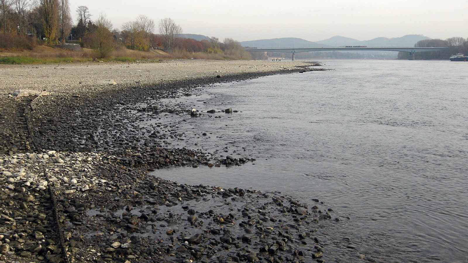
A prolonged European drought combined with extreme heat is pushing major rivers to record lows, disrupting shipping and energy production while worsening crop losses and wildfire risks. As dry conditions spread north, Europe’s water, agriculture, ecosystems and public health systems are coming under increasing pressure.
A long period of low rainfall combined with extreme heatwaves has placed half of the European Union and the United Kingdom under drought conditions. A report published on August 12 by the European Commission Joint Research Centre and the European Drought Observatory reveals that nine percent of the region reached a critical alert level by late July.
Satellite data from Copernicus, the Earth monitoring program of the European Union, shows that severely dry soil is now damaging crops and plants across the continent. In its latest assessment, the observatory warned that “the drought has built up since early spring due to lower rainfall and higher than average temperatures, turning into fuel for devastating wildfires.”
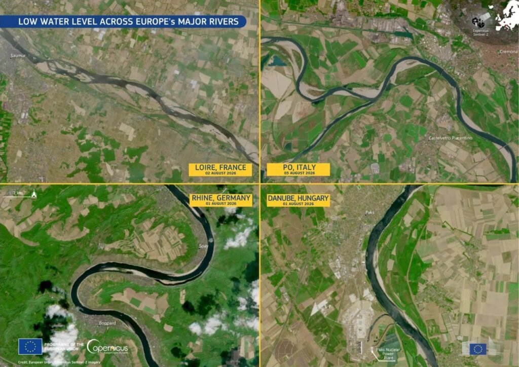
European Drought Reaches Across the Continent
The lack of rain has driven four of Europe’s largest rivers—the Rhine, Danube, Loire, and Po—to dangerously low levels. Near Cologne, Germany, the Rhine fell to a fresh record low of 49 centimetres by mid-August, according to the Rhine Waterways and Shipping Authority — nearly 20 centimetres below the previous record of 68 centimetres set earlier in the summer, which had itself broken the prior all-time low recorded in 2018. Because large cargo boats need deeper water to float safely, operators have been forced to carry much lighter loads to avoid getting stuck on the riverbed, and in places river traffic has largely halted. Carrying smaller loads requires more trips, creating major shipping delays for important industrial materials across central Europe.
At the same time, low water levels and rising temperatures are creating a serious energy crisis across the continent. In France, power companies had to cut back nuclear energy production because river water became too warm to safely cool reactors without harming aquatic life. Hydroelectric power generation has also plunged across the Alps, northern Italy, and central-eastern Europe. Copernicus analysts noted that low river flows on the Danube are creating “serious operational challenges” for power plant cooling. In Italy’s Po Valley, the dried-out river basin has triggered a separate disaster: saltwater from the Adriatic Sea has flowed inland into depleted channels, ruining farmland soil and cutting off freshwater supplies for local crops.
Wildfires Burn Over 550,000 Hectares Across Europe
Dry plants and extreme heat have triggered widespread wildfires across the continent. According to August 11 data from the European Forest Fire Information System, 552,437 hectares of land have burned within the European Union since the start of the year, spread across 1,614 individual fires of 30 hectares or larger. Although this total remains below the 667,342 hectares burned by the same date in 2025 — a season that went on to become the worst on record for EU wildfires, with 1,034,552 hectares burned in total — it is significantly higher than the 20-year historical average.
Recent satellite data shows a clear shift: large wildfires are no longer staying just in southern hotspots like Spain and Greece. As dry weather pushes northward, fire risks are expanding into cooler regions, including northwestern France, southern Great Britain, the Alps, and the Balkans. Experts at the Joint Research Centre emphasized that “wildfire risk is no longer confined to southern Europe but is increasingly affecting wider parts of the continent under prolonged hot and dry conditions.”
Declining Harvests and Rising Health Risks
Continued heat and dry soil are dealing a heavy blow to European farmers. According to assessments by the European Joint Research Centre, crop yields across central and eastern Europe have dropped significantly. Production estimates for key spring and summer crops, such as grain maize and sunflowers, have fallen by six to seven percent. Winter crops have also suffered, with yield forecasts declining between one and four percent compared to earlier projections.
High temperatures are having a severe impact on human health as well. Monitoring data from public health agencies and the World Health Organization reveals a sharp surge in heat-related emergency admissions and deaths during extreme temperature episodes. Data compiled from national health agencies — including Germany’s Robert Koch Institute, which alone recorded an estimated 11,900 heat-linked deaths — put the region’s heat-related death toll above 25,000 as of early August, highlighting the severe human cost of this summer’s weather.
Seasonal Outlook and Emergency Response
Weather predictions indicate that dry conditions will continue through early autumn. According to the Copernicus Climate Change Service, drier and warmer weather is expected to persist across central-western Europe and southern Scandinavia through September. Climate experts also warn that a developing El Nino pattern could keep global temperatures higher than normal well into spring 2027. “Water resources, crops, energy systems, river transport, and ecosystems are all under growing pressure,” the report warned, with heatwave risks remaining high through August.
To coordinate emergency aid, the European Union activated its Civil Protection Mechanism. A dedicated fleet of 22 firefighting aircraft, 5 helicopters, and ground teams have been placed on standby across 12 countries. Meanwhile, the Copernicus satellite service has responded to more than 30 emergency requests since June, providing real-time mapping data to help local authorities track active fires and assess land damage on the ground.
Earth
Asiatic Lions See Remarkable 70% Rise in a Decade
India’s Asiatic lion population has risen from 523 in 2015 to 891 in 2025, marking a 70.4% increase in a decade. But with the species still concentrated largely in Gujarat, the recovery also raises questions about habitat, disease risks, human–lion coexistence and the need for greater geographic resilience.

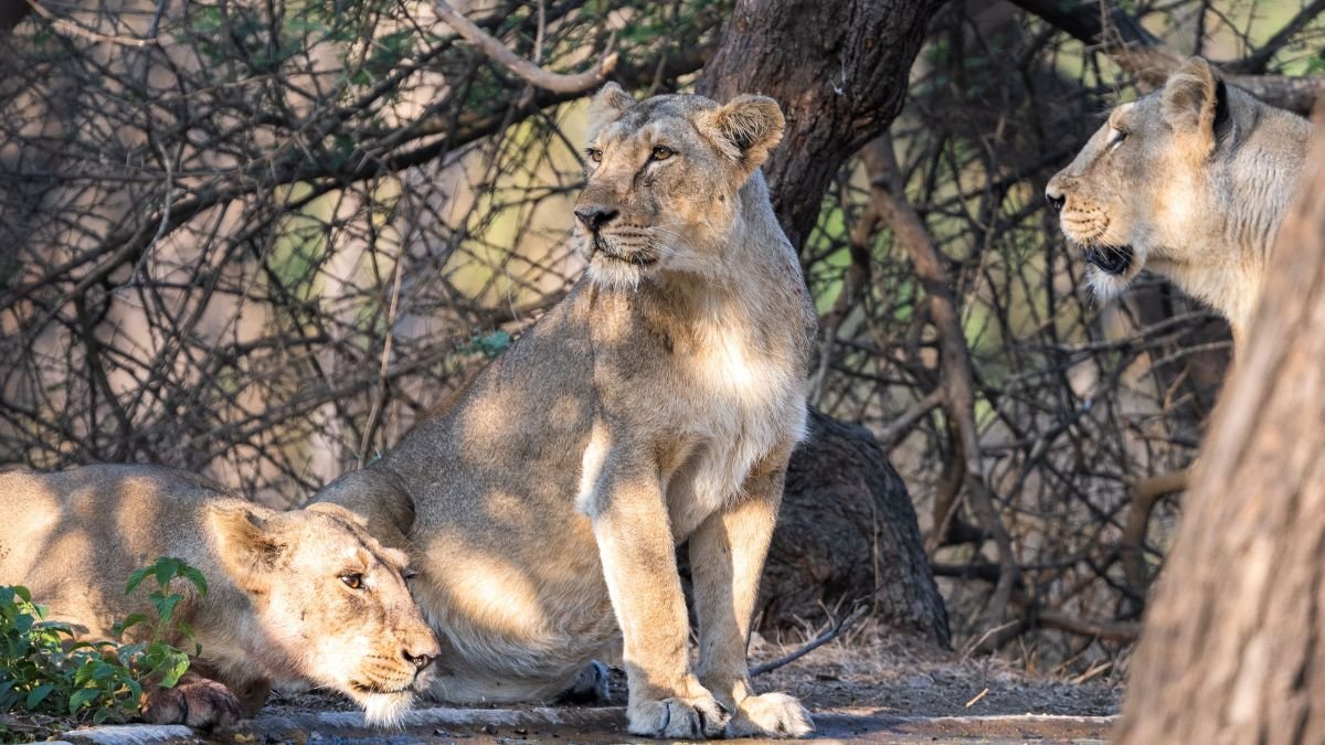
India’s Asiatic lion population has increased from 523 in 2015 to 891 in 2025, a 70.4% rise over a decade. Union Environment Minister Bhupender Yadav highlighted the increase on World Lion Day, August 10, crediting forest officials, conservationists and local communities for the recovery. The increase is an important conservation milestone. But for a species whose wild population remains concentrated in a relatively small geographical range, rising numbers are only part of the story.
The Asiatic lion (Panthera leo persica) is one of India’s most significant wildlife conservation successes. Once found across parts of Asia, the subspecies was driven to near extinction by hunting and habitat loss. Its remaining wild population is now concentrated primarily in Gujarat’s Gir landscape and surrounding areas.
A Decade of Population Growth
India’s lion population increased from 523 in 2015 to 674 in 2020 and reached 891 in 2025. The latest increase represents a 70.4% growth over ten years.

The recovery reflects the impact of long-term protection, habitat management, prey availability, scientific monitoring and the involvement of communities living around lion habitats. But population size alone does not establish whether a species is fully secure.
For the Asiatic lion, where the animals live is almost as important as how many there are.
The Risk of a Concentrated Population
Unlike many large carnivore populations distributed across multiple countries and ecosystems, India’s Asiatic lions remain concentrated largely in Gujarat.
This creates a potential vulnerability. A major disease outbreak, extreme weather event, environmental contamination or other ecological disturbance affecting the Gir landscape could threaten a significant proportion of the population.
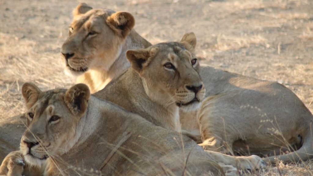
The risk became particularly evident during the 2018 canine distemper virus outbreak, when several Asiatic lions died. The episode demonstrated how infectious disease can become a serious conservation concern when a species is concentrated within a relatively limited landscape. Disease surveillance, veterinary care and monitoring have therefore become increasingly important alongside conventional habitat protection.
Why a Second Population Matters
The concentration of lions has also driven a long-running debate over establishing another free-ranging population. Kuno National Park in Madhya Pradesh has been proposed as a potential second home for Asiatic lions. The objective is not simply to increase the number of lions but to reduce the species’ dependence on a single geographical stronghold.
A geographically separate population could provide an additional safeguard if disease or another major disturbance affected the Gir landscape. However, the proposal has remained contentious, with questions around habitat suitability, prey availability, management and the transfer of lions from Gujarat. The debate reflects a wider conservation challenge: a species can have a growing population while remaining vulnerable because most of its individuals occupy the same landscape.
More Lions Also Mean a Greater Coexistence Challenge
Population recovery brings another issue into focus: human–wildlife coexistence. As lion numbers increase and animals disperse, they can move through agricultural and other human-dominated landscapes around the protected forests. This creates opportunities for wider habitat use but can also increase interactions with people and livestock.
For local communities, these encounters can mean livestock losses and safety concerns. Lions themselves face risks from roads, open wells, disease and other human-associated hazards.
This makes communities living around lion habitat an important part of the conservation equation. The long-term survival of the species will depend not only on protected forests but also on whether people and lions can continue to share the wider landscape.
For Sustainable Conservation
The increase from 523 lions in 2015 to 891 in 2025 shows that sustained conservation efforts can reverse a historic decline. But the next phase of conservation needs to ask more than whether the population is growing.
It must examine whether available habitat and prey can support further expansion, whether lions are becoming more geographically distributed, whether disease surveillance can detect outbreaks early and whether human–lion conflicts are increasing as the population grows.
The Asiatic lion’s recovery is therefore both an achievement and a reminder of the work ahead. For a species with a highly concentrated wild population, conservation success cannot be measured by numbers alone. Its real test will be whether the population becomes resilient enough to withstand disease, environmental change and the pressures of sharing its habitat with people.
Earth
The Trees That Stand Between Mumbai and the Sea
How Mumbai’s mangroves became the city’s first line of defence against floods, climate change, and coastal collapse.

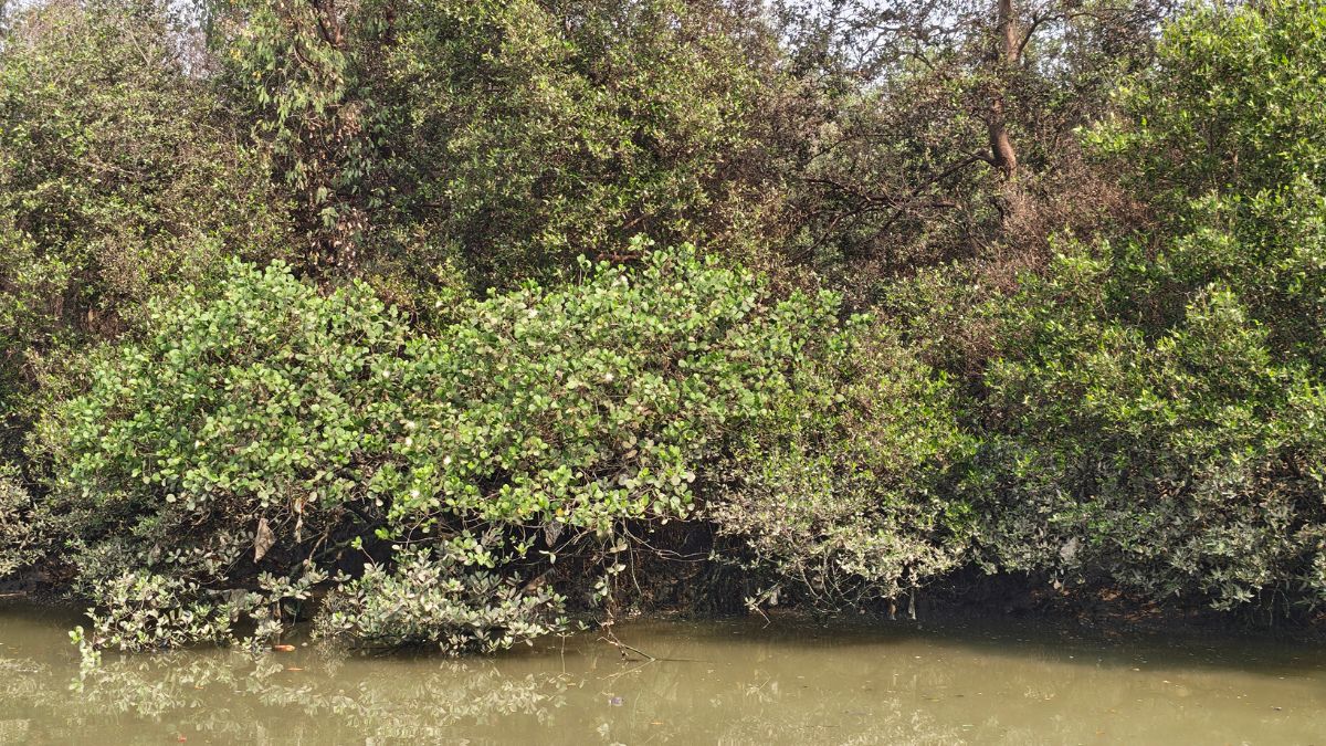
As the world marks the International Day for the Conservation of the Mangrove Ecosystem, Mumbai mangroves tell a story of survival, climate resilience, and lessons learned from the devastating 2005 floods. From Thane Creek to the Mithi River, these coastal forests reduce flood risk, store carbon, support marine biodiversity, and sustain millions of livelihoods. Yet despite legal safeguards and restoration efforts, pollution, infrastructure projects, and climate change continue to threaten one of India’s most valuable natural defences.
“This is Avicennia marina,” said Manish Zendeker, pointing to the trees lining the water as he steered his ferry through the narrow channels of the Thane Creek Flamingo Sanctuary. “In total, 17 species are found in Maharashtra. Overall, they are called mangroves, but among them, this is a distinct species. We see this more commonly here in Mumbai. If you go towards Ratnagiri, you will mostly see Sonneratia alba.” He went on, unprompted, into the mechanics of why the species in front of us mattered: “Its presence here is so important because it works to filter the creek water — it purifies it. Its roots go underwater and come back up, which are called pneumatophores, or breathing roots. Those roots have many tiny pores. When the high tide water comes in, their pores open up and absorb whatever pollution or chemicals are in the water. So that is its main benefit — it works to keep the creek water clean.”
What surprised our reporting team wasn’t that a boat driver on Thane Creek knew mangroves mattered — most people who live near them can tell you that much. It was the precision: a species name offered without hesitation, a north-south distinction between what grows here and what grows 300 kilometres south near Ratnagiri, a working theory of how the roots do their job, delivered from memory, between turns of the outboard motor. It was the kind of knowledge that usually lives in a research paper.
Today, 26 July, is the International Day for the Conservation of the Mangrove Ecosystem, a date the United Nations chose deliberately: it marks the anniversary of the 2005 Mumbai deluge, the day 944 millimetres of rain fell on the city in 24 hours and more than a thousand people died. The date is not a coincidence, and neither is the connection to Mumbai. What happened that day, and what has happened in the two decades since, is one of the clearest real-world demonstrations anywhere of what a mangrove forest is actually worth — and what a city pays when it disappears.
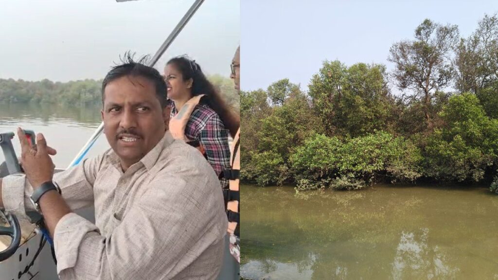
How mumbai mangroves protect the city from floods
By the time the 2005 floods hit, Mumbai had already spent roughly a decade quietly getting rid of its mangroves. Between the early 1990s and 2005, the city lost close to 40% of its mangrove cover — something in the range of 9,000 acres — much of it along the Mithi River, where the swampy, root-tangled land was drained and filled to build what is now the Bandra Kurla Complex, one of the city’s premier commercial districts. The Mithi itself, an 18-kilometre stormwater channel that carries overflow from Powai and Vihar lakes out to the Arabian Sea, had been narrowed, built over, and used for decades as an open drain for sewage and industrial waste.
When the rain came, the river had nowhere to put it. A 2018 hydrological case study of the Mithi River modelled what the mangrove loss actually cost the city in physical terms: intact mangrove forest along the riverbanks reduces flood wave height and cuts the inundation area by roughly 21%, by absorbing and slowing the surge before it reaches built-up land. Without that buffer, the 2005 floodwaters had nowhere to go but into the shops, homes, and railway lines of central Mumbai.
The flood changed the law almost immediately. Later that year, the Bombay High Court banned the destruction of mangroves on government land across Maharashtra and prohibited construction within 50 metres of any mangrove area, and by 2012 the state had set up a dedicated Mangrove Cell to enforce it. The reversal that followed is one of the more striking examples of legal protection actually working at scale: according to Forest Survey of India data, Mumbai’s own mangrove cover grew from 42 square kilometres in 2005 to 66 square kilometres by 2017, a 57% recovery. State-wide, Maharashtra’s mangrove cover more than kept pace, expanding from 186 square kilometres in 2013 to 320 square kilometres by 2019, according to the Mangrove Cell’s own figures.
That recovery is real, but it is not the whole story, and it is not evenly spread. Forest officials themselves have cautioned that a rising area figure can mask falling ecological quality — mangroves can be denser or thinner, healthier or stressed, without that showing up in a simple hectare count. And the growth has come alongside continuing, highly localised battles: mangrove clearance tied to the Navi Mumbai International Airport, the Jawaharlal Nehru Port Trust’s expansion, and the Mumbai Trans-Harbour Link have repeatedly ended up in court, with activists and the state’s own Mangrove Cell frequently on opposite sides of the same case. Nationally, the trend has also turned again: India lost an estimated 7.43 square kilometres of mangrove cover just since 2021, though that recent decline is concentrated in Gujarat and the Andaman and Nicobar Islands rather than in Mumbai itself. The net picture for the city is a genuine recovery, won directly by an emergency response to a specific disaster, that now has to be actively defended patch by patch rather than assumed to hold on its own.
The comparison that made the point hardest to argue with came from a single village. Nandakumar Pawar, a fisherman in Bhandup, a mangrove-fringed suburb in Mumbai’s north-east, has described being startled that his neighbourhood came through the 2005 deluge largely unscathed while the rest of the city drowned. A more than 800-hectare stretch of mangroves near his village had acted as exactly what mangroves are built to be — a sponge, absorbing the surge rather than passing it on to the houses behind it. Pawar went on to found Shree Ekvira Aai Pratishthan, a fishing-community organisation that today serves as caretaker of some 1,042 hectares of mangrove forest between Mulund and Vikhroli along Thane Creek, working with the state Forest Department on protection and restoration. Pawar, now in his sixties, also serves as president of the Maharashtra Small-Scale Traditional Fish Workers Union — one measure of how directly a single flood turned a fisherman into one of the city’s more persistent mangrove advocates.
Thane Creek: a working case study
The waters our reporting team travelled — Thane Creek, Asia’s largest creek at 26 kilometres long — offer a live, ongoing version of this story rather than a historical one. The northern stretch of the creek was declared a flamingo sanctuary in 2015, protecting 1,690 hectares, of which 896 hectares are mangrove forest and the rest open water and mudflats. The creek has drawn over 30,000 migratory flamingos annually since the early 1990s, and by some counts accounts for close to a fifth of the mangrove species diversity found anywhere in India.
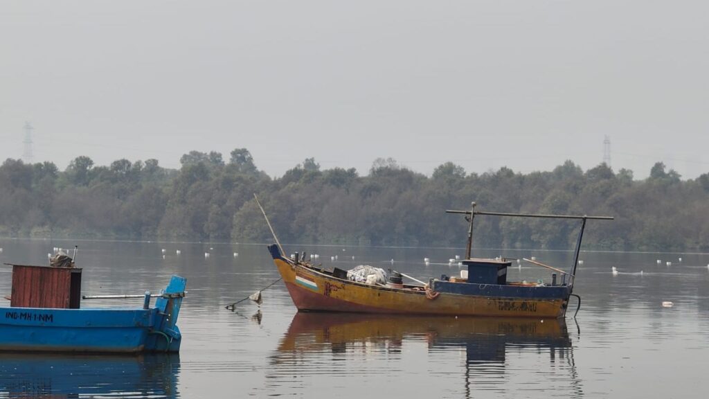
It is also a case study in what happens when mangroves are stressed rather than removed outright. Untreated sewage, industrial effluent, and construction runoff have degraded water quality across large stretches of the creek; one WWF-India assessment found that 58 of 69 marine species once recorded there have disappeared over a 14-year period, largely attributed to rising arsenic levels and falling oxygen content in the water. The sanctuary’s own mangroves have been the subject of repeated pollution complaints, including an industrial pipeline leak flagged by local fishermen in 2022. The lesson embedded in Thane Creek is that mangrove protection on paper — a sanctuary notification, a protected-area boundary — does not by itself guarantee a functioning ecosystem; the water quality and the tree cover have to be defended separately and continuously.
Restoration work has had some success. Community-led projects around Thane Creek and Mahim Bay have restored more than 100 hectares of mangrove cover in recent years, working with local fishing communities to combine habitat recovery with sustainable fishing practices and small-scale eco-tourism — the same boat tours that carried our reporting team through the sanctuary.
What the research says mangroves are worth, everywhere
Mumbai’s experience is a local instance of a pattern researchers have now quantified at a global scale, and the numbers are large enough to change how governments plan coastal defence.
A widely cited 2020 study published in Scientific Reports, led by researchers Pelayo Menéndez and Michael Beck, modelled the flood-protection value of every mangrove forest on Earth at 20-kilometre resolution and found that mangroves currently prevent more than US$65 billion in flood damage every year, and protect over 15 million people from flooding they would otherwise experience. A follow-up analysis, published in the World Bank’s Changing Wealth of Nations 2024 report, priced the total long-term value of that protection — the present value of a century of avoided flood damage — at US$855 billion globally. The countries that benefit most in absolute terms include China, Vietnam, the United States, Australia, and India; in terms of the sheer number of people protected, Vietnam, India, and Bangladesh top the list.
Mangroves do this largely through friction. Their dense, tangled root systems and low canopy break up wave energy and slow storm surge as it moves inland; the State of the World’s Mangroves 2024 assessment estimates that mangrove forests reduce flood depth by 15–20% compared with a coastline that has none.
The carbon case is, if anything, stronger. Mangrove soil is waterlogged and largely oxygen-free, which means the organic matter that collects in it barely decomposes — it simply stays there, sometimes for thousands of years. Researchers estimate mangroves store an average of 394 tonnes of carbon per hectare, split roughly 78% in the soil, 15% in above-ground biomass, and the rest below ground, figures that vary sharply by region: forests in Southeast Asia and the Philippines can exceed 650 tonnes per hectare, while carbon density in parts of the Middle East falls below 100. Even though mangroves cover under 1% of the world’s tropical forest area, one estimate puts their total global carbon stock at around 6.5 billion tonnes — the single largest carbon pool of any blue carbon ecosystem, ahead of seagrass meadows and salt marshes combined in density per hectare, if not in total area.
None of this is guaranteed to last. The global rate of mangrove loss has slowed — from roughly 1% a year in the 1990s to about 0.66% a year between 2010 and 2020, and the FAO’s 2025 Global Forest Resources Assessment even found a net global gain since 2010, reversing decades of decline — but a 2024 assessment by the International Union for Conservation of Nature found that more than half of the world’s mangrove ecosystem types are still at risk of collapse by 2050 if current pressures continue, a category that includes South India’s mangroves specifically, which the IUCN has already classified as critically endangered. Area recovering is not the same as risk disappearing; it mainly means the fight has shifted from outright clearance to slower, harder-to-see pressures — pollution, aquaculture expansion, and the kind of localised infrastructure disputes already playing out around Mumbai.
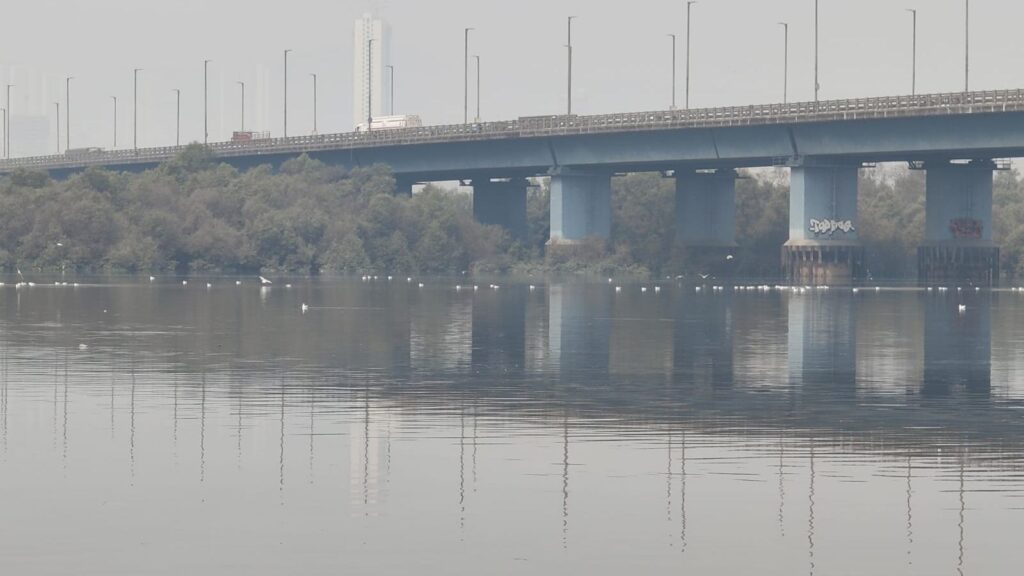
Governments have started responding at the scale the research implies is necessary. At COP28 in 2023, the Mangrove Breakthrough initiative set a global target of restoring or protecting 15 million hectares of mangrove forest by 2030, backed by a proposed US$4 billion in financing — an explicit bet that the cost of restoration is small next to the avoided cost of flooding, storm damage, and lost carbon storage that follows when mangroves disappear.
What the boat driver already knew
None of this would have surprised the man steering the boat through Thane Creek. Long before any of these studies were published, people who live beside mangrove forests — fishermen in Bhandup, boat operators on the creek, families along the Mithi’s banks — had already worked out, through direct experience, what the data now confirms with figures: that the trees standing between them and the water were doing something that mattered, long before anyone put a price on it.
Mumbai’s flood risk has not gone away since 2005, even though its mangrove cover has, on paper, come back. Sea levels are rising, monsoon rainfall is becoming more erratic and more intense, and the city’s population and built footprint keep expanding into the same low-lying, once-swampy land that used to absorb the water. The mangroves that have grown back — in Thane Creek, along Mahim Bay, in the restored patches near the Mithi — are doing exactly the job the research describes: quietly absorbing surge, filtering pollutants, and storing carbon. Whether they keep doing it depends less on whether the trees are allowed to grow than on whether anyone keeps watching, largely unnoticed, until the next storm makes their condition impossible to ignore.


Record Drought and Extreme Heat Push European Rivers to Lows as Wildfires Spread North

79 Years After Independence: Is India Investing Enough in Science and Technology?

When AI Becomes a Cyber Weapon: How Artificial Intelligence Is Changing Cyberattacks

Indigenous Peoples and Nature Conservation: What the Research Shows

Total Solar Eclipse 2026: What Happened and Where Was It Visible?

The 2026 Fields Medals: Four Proofs, Four Decades-Old Problems Solved

After Kerala’s Deadliest Landslide, the Hardest Thing to Rebuild Was Childhood

When the Monsoon Returns, Fear Returns: How Climate Disasters Are Reshaping Mental Health in Himachal Pradesh

Is Something Really Wrong With India’s Education System?

Why Is India Flooding If El Niño Predicted a Weak Monsoon?

-

 Math3 weeks ago
The 2026 Fields Medals: Four Proofs, Four Decades-Old Problems Solved
-
Climate2 weeks ago
After Kerala’s Deadliest Landslide, the Hardest Thing to Rebuild Was Childhood
-
Society1 month ago
West Asia Crisis: Can Kerala’s Returning Gulf Migrants Find a Future in the Green Economy?
-
Space & Physics3 months ago
India Semiconductor Mission: ‘It’s Not About Fabs. It’s About Building An Entire Ecosystem’
-
Climate2 months ago
The Climate World Cup? How Climate Change Could Affect Player Performance at the 2026 World Cup
-
Society1 month ago
What Is Civilisational Diplomacy? Understanding India’s Newest Foreign Policy Tool
-
Society2 months ago
From Bell Labs to the Classroom: A Second Career in Teaching
-
Space & Physics2 months ago
Engineers Develop Dual-Mode Propulsion System for Next-Generation Small Satellites