
Earth
Expanding Roads in Africa’s Mountains Threaten Endangered Wildlife
As road networks expand into Africa’s mountainous regions, endangered and vulnerable wildlife face increasing risks of roadkill. Experts warn that without better monitoring and conservation efforts, this growing threat could decimate unique biodiversity

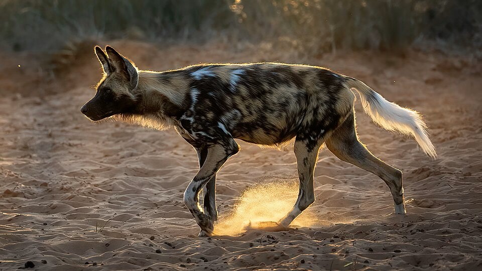
The remote mountain regions of the world, once pristine and largely untouched by human development, are becoming increasingly perilous for wildlife. As road networks extend into these rugged terrains, endangered and vulnerable species are facing an ominous new threat—roadkill.
Species such as the African wild dog (endangered), lions and leopards (both vulnerable), elephants (endangered), and honey badgers (near threatened) are at grave risk, according to new research presented by Professor Aliza le Roux, Assistant Dean of the Faculty of Natural and Agricultural Sciences at the University of the Free State. These animals, many classified by the International Union for Conservation of Nature (IUCN) as at risk, face an increasingly perilous existence.

In her compelling presentation at the Southern African Mountain Conference (SAMC2025), she revealed the stark reality that these once-untouched ecosystems are now being invaded by expanding roads that are leading to more wildlife-vehicle collisions, many of them fatal.
“Wildlife in these regions is incredibly vulnerable, and as roads push deeper into mountainous areas, we’re seeing a dramatic rise in roadkill incidents,” said Prof Le Roux. “Among the casualties, we’re finding not just mammals, but also critically endangered birds like the hooded vulture and the steppe eagle.”
The conference, which brought together leading researchers, policymakers, and environmental experts, focused on the dire state of mountain ecosystems, communities, and biodiversity. UNESCO, in partnership with the University of the Free State’s Afromontane Research Unit, the African Mountain Research Foundation, and the Global Mountain Safeguard Research Programme, facilitated the gathering.
For the past several months, Prof Le Roux and her colleagues—Dr Katlego Mashiane, a lecturer at the UFS Department of Geography, and Dr Clara Grilo of the BIOPOLIS project in Portugal—have scoured decades’ worth of data on roadkill, analyzing published papers from 1971 to 2024. The findings were both alarming and illuminating, revealing that the majority of roadkill data available for Africa has emerged only in the 21st century.
A Growing Threat to Wildlife
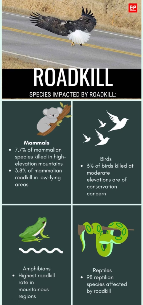
In mountainous regions, amphibians were found to be the most frequent roadkill victims, while mammals, particularly those most vulnerable to extinction, were most often killed in the low-lying regions. In some high-elevation mountains, nearly 8% of mammals killed on the roads were species classified as endangered or vulnerable. Even more alarming, the roadkill rate in these regions continues to rise as human development accelerates.
“Many smaller species—those weighing less than 1 kilogram—fall victim to vehicles simply because we don’t see them. However, larger mammals, such as elephants or antelope, are often noticed only after the crash,” Prof Le Roux explained. “When these large animals are killed, it’s not just a loss for the species; it’s a loss for us too, as these collisions can cause significant damage to vehicles and pose a danger to human drivers.”
The risk is compounded by unpredictable weather and treacherous mountain roads, where sudden changes in terrain and visibility make it difficult for both drivers and wildlife to react in time. Prof Le Roux and her team noted that the ruggedness of these areas makes it harder for animals to detect oncoming vehicles, raising the likelihood of accidents.
“These regions are already dangerous for drivers, but for wildlife, the roads are a death trap,” Prof Le Roux said. “The increased number of vehicles, combined with better-paved roads, is putting more and more wildlife at risk.”
Using sophisticated tools like Google Earth Engine’s geospatial platform, the researchers analyzed data from a variety of terrains, classifying areas by elevation. High-elevation mountains, defined as regions above 2,000 meters, moderate elevations between 1,500 and 2,000 meters, and lowland areas below 1,500 meters were all found to have significant roadkill rates, particularly among mammals and birds of conservation concern.
Data Gaps and Underreporting
The study highlighted a critical issue: limited data. Despite the alarming trends, the lack of comprehensive, systematic data across much of the African continent has left major gaps in understanding the full scope of the roadkill crisis. Data was available for only 10 countries, and much of the information consisted of ‘snapshots’ rather than long-term, continuous monitoring.
“There is so much we don’t know about the true scale of this issue across Africa, particularly in the central and western regions,” Prof Le Roux lamented. “What we do know is that these collisions are happening in areas that are home to species that exist nowhere else. We cannot afford to ignore the threat to biodiversity in these mountain ecosystems.”
As the push for infrastructure development grows, the consequences for wildlife have never been clearer. The growing mortality rate among vulnerable species, many of which are already at risk of extinction, could result in devastating losses for biodiversity.
Prof Le Roux and her colleagues urge immediate action to mitigate these risks, calling for more comprehensive data collection, better road planning, and the implementation of wildlife corridors to safeguard these precious ecosystems.
“We must recognize that as we expand our roads into these high-risk areas, we’re also taking a toll on the very creatures that make these mountains so unique,” Prof Le Roux said, emphasizing the urgent need for a balanced approach to development and conservation.
As the conference came to a close, one message echoed throughout the halls: The future of Africa’s mountainous wildlife depends on the actions we take now. The clock is ticking, and the road ahead may be the final journey for some of the continent’s most endangered creatures.




Earth
Hunter Valley Coal Mine Gets Approval to Run to 2045. What Does It Mean for Australia’s Climate Transition?
Australia’s Hunter Valley coal mine has been approved to operate until 2045, raising questions about how the extension fits into the country’s transition towards lower emissions and its net-zero target.
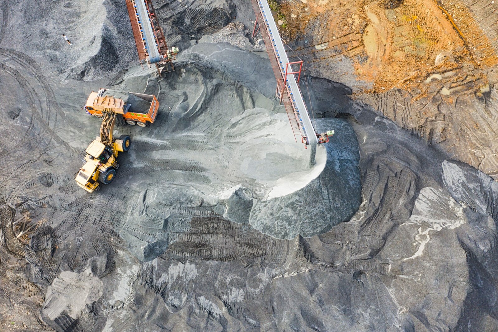
Australia’s transition away from fossil fuels faces a new test after New South Wales approved the continuation of the Hunter Valley Operations (HVO) coal mine until 2045.
The NSW Independent Planning Commission (IPC) on September 30 approved the continuation of HVO North until the end of 2045 and HVO South until the end of 2042. The project would allow an estimated 429 million tonnes of coal to be extracted from the Hunter Valley near Singleton.
The decision is significant not only because of the scale of the mine, but because it extends a major coal operation into the period in which Australia is committed to sharply reducing its greenhouse-gas emissions.
Australia’s current climate commitments include cutting national emissions by 43 per cent from 2005 levels by 2030 and by 62–70 per cent by 2035, with net-zero emissions targeted for 2050.
The latest government inventory estimates Australia’s emissions at 452.4 million tonnes of carbon dioxide equivalent in the year to June 2026, a preliminary 1.8 per cent decline from the previous year. Emissions in the year to March 2026 were 25 per cent below 2005 levels.
Against that backdrop, the IPC acknowledged that the HVO project would have a substantial climate footprint. Its statement of reasons estimates that the project could result in about 809 million tonnes of greenhouse-gas emissions from local mining operations and the eventual combustion of exported coal overseas. The commission said those emissions would contribute to climate impacts in the Hunter, NSW and globally.
The 809-million-tonne figure needs an important qualification to note. it is a lifecycle-related estimate that includes overseas combustion emissions and should not be interpreted as emissions produced directly by the mine.
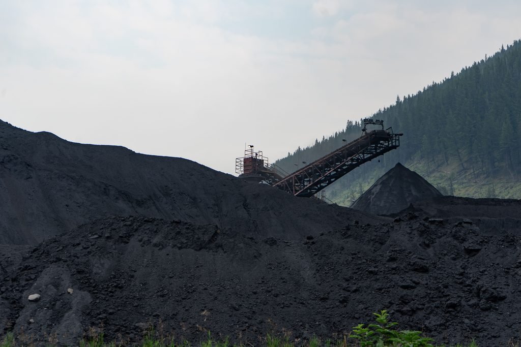
Coal mine.Representational image.Image credit:Pexels
The economic case for the extension is substantial. HVO employs more than 1,500 people and engages more than 800 suppliers, according to evidence presented to the IPC. The NSW Government says the continuation could secure up to 1,500 ongoing jobs and create about 600 temporary positions through infrastructure upgrades, subject to federal approval.
The approval also comes with conditions intended to address the mine’s emissions and its eventual transition. HVO must prepare a Scope 3 Management Plan dealing with emissions associated with exported coal, maximise renewable electricity use at the mine and purchase additional carbon offsets. It must also prepare a comprehensive closure plan within 12 months, in consultation with local councils and communities, outlining how the mine will transition towards closure while supporting workers and the local economy.
The NSW Government argues that the decision can support regional employment while maintaining the state’s broader emissions-reduction pathway. It says the approved proposal has 43 per cent lower Scope 1 emissions than the company’s 2022 application. NSW’s 2026–50 coal policy also allows extensions of existing mines while ruling out applications for new greenfield coal mines.
At the national level, the federal Safeguard Mechanism is intended to reduce emissions from Australia’s largest industrial facilities. The government says the mechanism is designed to put covered facilities on a trajectory consistent with the country’s 2030 target and net-zero goal.
That creates the central question around HVO’s extension. How does Australia manages the economic and employment role of existing coal regions while reducing emissions over the same period.
The NSW approval does not settle that question. The project still requires approval from the Australian Government under the Environment Protection and Biodiversity Conservation Act.
For the Hunter Valley, the decision provides a longer operating horizon for an established coal industry. For Australia’s climate transition, it brings the challenge of managing an economy in which existing fossil-fuel assets continue operating while national policy seeks progressively sustainable energy and lower emissions.
Earth
Earth is Heating Up: The Economic Cost of a Rising Sea
Rising seas are turning coastal exposure into an economic challenge. Cities must weigh the cost of protecting infrastructure, livelihoods and communities against the growing risks of inaction.
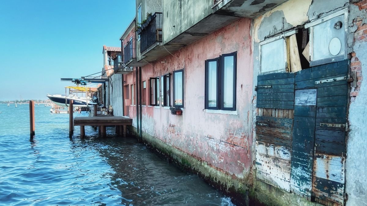
For Mumbai, the sea has always been an economic asset. Its position along the Arabian Sea helped turn the city into a centre of trade, finance, industry and transport. But the same coastline that sustains its economy also exposes homes, roads, businesses and critical infrastructure to flooding and rising sea-level. The United Nations identifies Mumbai and Kolkata, along with Dhaka, as low-lying South Asian cities where more than 14 million people face the immediate risk of losing their homes to permanent inundation.
What rising seas cost, however, depends on what a coastline holds. In Bangladesh, a one-metre rise could inundate around 4,000 sq km of land, nearly 3% of the country and climate impacts including rising seas could force more than 13 million people to move within the country by 2050. In Saint Kitts and Nevis, saltwater intrusion threatens the freshwater aquifers on which communities depend. In New York City, sea levels could rise by up to 1.3 metres by the end of the century, putting a vast concentration of infrastructure and economic activity at greater risk.
Around 770 million people, roughly one in every 10 people on Earth, live in coastal areas less than five metres above the high-tide line. Nearly 900 million people live in low-lying coastal zones, and more than one billion could be exposed to coastal hazards by 2050. These are not empty margins of the map. They contain ports, roads, industries, homes, tourism facilities and freshwater systems that support economies and everyday life.
That makes sea-level rise more than a question of where the water will reach. It is a question of what sits in its path, who depends on it, and how much it will cost to protect, rebuild or relocate what cannot be saved.
The Baseline is Already Moving
Global mean sea level remained near the record high observed in 2024, according to the World Meteorological Organization’s State of the Global Climate 2025. Between 2012 and 2025, sea level rose at an average rate of 4.75 millimetres a year, compared with 2.65 mm a year between 1993 and 2011. In 2024 alone, global mean sea level rose 5.9 mm, the highest annual increase in the satellite record, with exceptional ocean warming a major factor.
The economic significance lies in what that extra water does to the baseline. A higher sea means tides can reach critical infrastructure more often. Storm surges can travel farther inland. Drainage systems can become less effective. Flooding that was once rare can become recurrent, bringing repeated repair costs and disruption.
The UN estimates that an extreme sea-level event that historically occurred once every 100 years could occur at least annually at more than half of the world’s tide-gauge locations by 2100 under all the scenarios examined. For businesses and governments, that changes the economics of risk.
When the Sea Threatens More Than Land
Mexico’s coastline is more than a boundary between land and sea. With more than 11,000 kilometres of coastline and nearly half its population living in coastal states, the country is already confronting the wider consequences of a rising sea.
In its contribution to the UN negotiations, Mexico said sea-level rise is putting pressure on ecosystems, infrastructure, livelihoods and water security. Its message was that the response cannot stop at protecting land from encroaching water. It must address the systems and communities that depend on vulnerable coasts. Mexico also called for the international response to move from broad commitments towards a smaller set of clear, actionable priorities, grounded in international law.
That shifts the question from how much land could be lost to the sea to what happens to the people and systems that depend on that land. For coastal countries, that distinction could determine how the cost of rising seas is ultimately distributed.
Trillions of Dollars are Exposed
The physical assets at risk are already enormous. Infrastructure worth at least 1.8 trillion dollars is exposed to sea-level risks globally. More than 80% of global goods trade is carried by sea, making ports and the networks connected to them particularly important to the world economy.
The potential losses rise sharply as sea levels climb. The UN report cites estimates of $1.7 trillion to 5.5 dollars trillion in residual damage costs from sea-level rise over the coming century. A global mean sea-level rise of 20 centimetres by 2050 could contribute to more than $1 trillion in annual flood losses across the world’s 136 largest coastal cities. Without adaptation, global annual losses have been estimated at 1.2 trillion dollars to 4 trillion dollars.
These figures capture more than the cost of repairing flooded buildings. A damaged port can interrupt manufacturing hundreds of kilometres inland. Flooded roads can prevent workers from reaching businesses. Power and sanitation failures can halt economic activity. Repeated disruption can make coastal locations more expensive to insure and less attractive for investment. The economic damage can therefore travel well beyond the flood line.
Cities Face a Compounding Bill
Coastal cities concentrate both people and capital. Their economic advantage has historically come partly from proximity to the sea. Ports connect them to global trade. Waterfronts support tourism and real estate. Rivers and estuaries provide transport, fisheries and access to freshwater.
The same geography now creates concentrated exposure. Nearly 500 million people live in low-lying river-ocean zones. In South Asia, more than 14 million people in low-lying cities, including Mumbai and Kolkata, are identified as being at immediate risk of losing their homes to permanent inundation. In some areas, land subsidence compounds sea-level rise, increasing the rate at which relative water levels rise.
For households, the consequences can include damaged homes, lost income and rising costs of recovery. For cities, the bill can include repeated repairs to roads, drainage, public buildings and utilities. And there is a less visible cost: the money that must be spent simply to keep existing systems functioning as the baseline changes.
India: Exposure Meets Rapid Development
India’s coastline makes the challenge clearer. Coastal cities and industrial regions are expanding alongside a coastline exposed to cyclones, storm surges, flooding and erosion. As development continues, more assets are being placed in areas where future climate risks need to be considered.
INCOIS has assessed future changes in average and extreme sea levels at 11 locations of India’s coast and islands. Under the high-emissions SSP5-8.5 scenario, relative mean sea level by 2100 is projected to rise between 0.62 metres at Visakhapatnam and 0.87 metres at Bhavnagar, relative to the 1995–2014 baseline.
Projected extreme sea-level increases are higher, ranging from 0.68 metres at Chennai to 1.12 metres at Bhavnagar. These numbers matter economically because cities do not experience mean sea level in isolation. A higher baseline interacts with tides, cyclones, storm surges and waves, increasing the potential for damaging events.
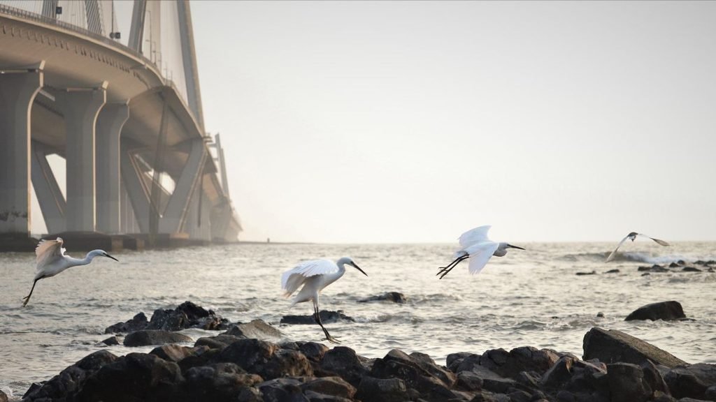
INCOIS found that coastal regions north of 13°N are particularly vulnerable to changes in extreme sea levels, with the Gulf of Gujarat and northern Bay of Bengal showing some of the largest changes in tidal maxima and climate extremes. The challenge for India is therefore not simply protecting today’s coastline. It is deciding where tomorrow’s infrastructure, housing and economic activity should be concentrated.
The Cost of Adaptation
Avoiding losses will itself require substantial investment. The UN estimates that developing countries need 310 billion dollars to 365 billion dollars every year for adaptation, while adaptation finance stood at about 26 billion dollars in 2023. Adaptation costs in developing countries are estimated to be 10–18 times current public adaptation finance.
Cities may need to strengthen drainage, raise roads, protect ports, upgrade water systems and reinforce critical infrastructure. Coastal ecosystems may need restoration and space to migrate inland. Some communities may eventually require planned relocation. A seawall may make sense around a densely developed port. A wetland may offer better protection in another location. In places facing persistent inundation, continuing to rebuild may cost more than planned relocation.
The UN report points to a combination of measures, including risk-informed planning, early-warning systems, resilient infrastructure, nature-based approaches and, where necessary, relocation.
Paying Later Could Cost More
One of the central economic questions is timing. Sea-level rise is a slow-onset hazard. Its costs accumulate gradually, while much disaster financing is designed around sudden events. Waiting until repeated flooding becomes a crisis can leave governments paying for emergency repairs instead of planned adaptation.
Money spent before infrastructure is repeatedly damaged can reduce future losses. Coastal planning can prevent new assets from being locked into high-risk locations. Early-warning systems can limit casualties and economic disruption. Protecting wetlands can preserve a natural buffer while supporting fisheries and other livelihoods. Adaptation is therefore not simply an expenditure. It can also be a way of limiting future losses.
Changing Coastline, an Economic Choice
The ocean will continue to rise for centuries because of heat already stored in the climate system and the slow response of glaciers and ice sheets. The economic question is how societies respond to that trajectory.
The sea will not wait for cities to settle their priorities. For Mumbai, rising seas will shape decisions about what to protect, where to build and how much risk communities can bear. The water may rise gradually. The cost of being unprepared will not.
Earth
How India’s River Dolphins Navigate a Changing River System
India’s river dolphins are being counted again in 2026, as researchers assess populations and habitats after a 2021–23 survey estimated 6,327 dolphins across eight states. The findings could reveal how changing river conditions are affecting the species.
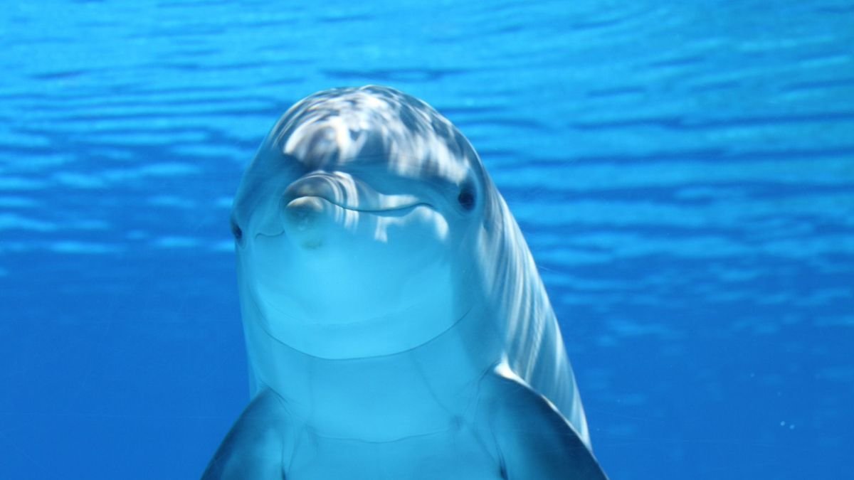
Dolphins recognise individuals, learn behaviours, remember information and communicate through a sophisticated repertoire of sounds. In some populations, they even use tools. These abilities have made dolphins one of the most closely studied animals in research on animal cognition. But “intelligent” is a broad description. Scientists studying dolphin cognition are asking more specific questions: How does a dolphin learn? What does it remember? How does it recognise another individual? How does it use information from its surroundings to make decisions?
Some of the clearest answers have come from bottlenose dolphins. They can develop individually distinctive signature whistles, learn behaviours socially and retain information about other dolphins. In Shark Bay, Australia, bottlenose dolphins have been observed using marine sponges while foraging, a behaviour that can be passed from mothers to calves.
The research tells us that dolphins are capable of sophisticated learning and social behaviour. It also raises a less familiar question for India: what happens to a species with such a complex relationship with its surroundings when those surroundings are changing?
India’s River Dolphins Live by Listening
The Ganges river dolphin has an unusual way of experiencing its habitat. It has extremely limited vision and depends heavily on echolocation. In the turbid waters of the Ganga and its tributaries, it sends out high-frequency clicks and interprets the returning echoes to locate prey and navigate. Its survival therefore depends on more than whether there is water in the river.
It needs suitable depth and flow, enough prey and stretches of habitat through which it can move. Dams and barrages can alter these conditions. Water extraction can reduce flows. Fishing can lead to accidental entanglement, while pollution can affect the aquatic food chain.
The river is also a working landscape for people. It supplies water, supports agriculture and fisheries, and is increasingly shaped by infrastructure. For the dolphin, those same interventions change the conditions under which it lives.
How Many Dolphins does India Have?
For the first time, India has a national baseline. A survey conducted between 2021 and 2023 covered more than 8,500 km of rivers across eight states and estimated 6,327 riverine dolphins. The overwhelming majority were Ganges river dolphins—6,324. Only three Indus river dolphins were recorded in the Beas River.
Uttar Pradesh and Bihar accounted for the largest populations. It is a count of riverine dolphins, not all dolphins found in Indian waters. India’s coast and estuaries support several marine and estuarine species, for which population information is less comprehensive.
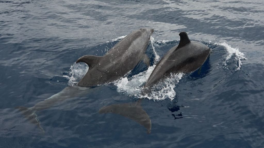
More importantly, a national total cannot show everything happening inside individual rivers. Two stretches of the same river can offer very different conditions for dolphins. A national population may therefore hide local changes in habitat, distribution or abundance. That is why India is counting them again.
The Second National Assessment is Underway
In January 2026, India began its second range-wide estimation of riverine and estuarine dolphins under Project Dolphin. The Wildlife Institute of India is coordinating the assessment with state forest departments and conservation organisations. The exercise includes Irrawaddy dolphins in the Sundarbans and Odisha, while researchers are also using underwater acoustic monitoring to detect dolphins through their sounds.
The value of a second survey is not simply that it will produce another number. It will allow researchers to compare populations and distribution with the earlier baseline and begin identifying where changes are occurring.
What Protects Dolphins Under Indian law?
The Wild Life (Protection) Act, 1972 provides the principal legal protection. The Ganges and Indus river dolphins are listed under Schedule I, which provides the highest level of protection under the Act. Hunting is prohibited except in circumstances specifically permitted by law.
The Ganges river dolphin was declared India’s National Aquatic Animal in 2009. In 2020, the government launched Project Dolphin, bringing riverine and marine dolphins under a dedicated conservation programme focused on population assessment, habitat protection, research and reducing threats.
Yet there is a gap between protecting a species and protecting the conditions it needs. A protected-species law can prohibit hunting. It cannot, by itself, determine how much water is diverted from a river, how a barrage affects connectivity or how fishing pressure is managed. Those decisions are made through several parts of India’s environmental and development policy.
What does the Number Reveal?
For a Ganges river dolphin, a healthy river is defined by measurable conditions: enough flow and depth to move through its habitat, sufficient prey to feed on, connected stretches of water and fewer risks from fishing gear and pollution.
That makes the 6,327-dolphin estimate more than a conservation headline. It is a baseline against which India can track whether those conditions are supporting or limiting dolphin populations. The second national assessment should show where populations are increasing, declining or shifting. The harder task will be linking those changes to what is happening in the rivers—changes in flow, habitat connectivity, prey availability, fishing pressure and pollution.
That is where dolphin conservation moves beyond counting. Protecting the species also means managing the river conditions on which its survival depends.


NMC Directs Medical Colleges to Set Up Patient Safety Committees

The Monsoon’s New Rhythm: Less Rain, More Intense Downpours

World Food Day: India’s Childhood Obesity Burden Raises Concerns Over Diabetes Risk

COP17: Can the World Still Meet Its Biodiversity Goals by 2030?

Chandigarh’s Sukhna Wetland Gets Ramsar Recognition, Taking India’s Count to 103

From Scams to Screens: How the National Stock Exchange Rewrote India’s Equity Story

Knowing When to Think for Ourselves: AI, Intuition and the Education of Discernment

After a Scorching Summer, Delhi’s Children Are Slow to Return Outdoors

Two Chemists Win Nobel Prize for Solving a Century-Old Puzzle: Why Life Picks One Hand Over the Other

India’s AI Moment Rests on More Than Code

-

 Math3 months ago
The 2026 Fields Medals: Four Proofs, Four Decades-Old Problems Solved
-
EP Deep Dive: Data & Solutions3 months ago
After Kerala’s Deadliest Landslide, the Hardest Thing to Rebuild Was Childhood
-
EP Deep Dive: Data & Solutions3 months ago
West Asia Crisis: Can Kerala’s Returning Gulf Migrants Find a Future in the Green Economy?
-
Space & Physics5 months ago
India Semiconductor Mission: ‘It’s Not About Fabs. It’s About Building An Entire Ecosystem’
-
Interviews4 weeks ago
From Scams to Screens: How the National Stock Exchange Rewrote India’s Equity Story
-
Climate5 months ago
The Climate World Cup? How Climate Change Could Affect Player Performance at the 2026 World Cup
-
Society3 months ago
What Is Civilisational Diplomacy? Understanding India’s Newest Foreign Policy Tool
-
Society4 months ago
From Bell Labs to the Classroom: A Second Career in Teaching